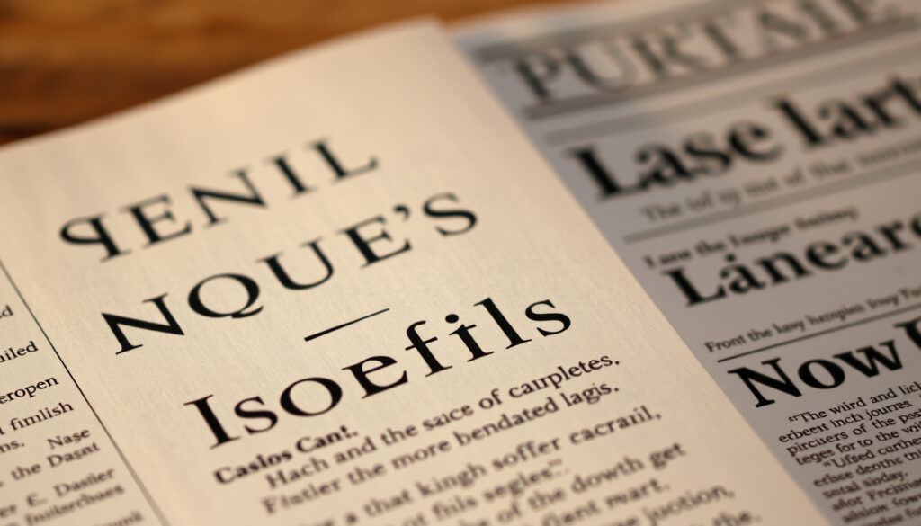
What Is a Serif Font? Examples, Types and Best Uses
You’ve probably noticed those small “feet” at the bottoms of letters in Times New Roman — but what exactly makes a font “serif,” and does it matter in practice? Beyond that distinctive trait lies a typographic tradition stretching back to Roman stonecutting, and knowing when a serif font earns its keep (and when it doesn’t) can sharpen your next design decision. The US State Department recently made font policy a matter of public record when Secretary of State Marco Rubio ordered official documents back to Times New Roman in 2025, calling its predecessor “informal” and noting Calibri “clashes” with the department’s letterhead.
Core Definition: Small line or stroke attached to end of larger stroke ·
Classic Example: Times New Roman ·
Counter Example: Calibri (sans serif) ·
Roots: Ancient Roman square capitals ·
Suggested Use: Authoritative, professional body text
Quick snapshot
- Serif = small stroke at letter end (Made Good Designs)
- Times New Roman is a transitional serif font (Made Good Designs)
- Calibri is a humanist sans-serif font (Made Good Designs)
- Released in 1932 and 2007 respectively (Made Good Designs)
- Exact performance metrics in legibility studies across diverse populations
- Regional font preference data outside US/EU markets
- Licensing cost differentials between Times New Roman and Calibri
- Serif fonts first printed in Roman type styles in the late 1400s (Type Tasting)
- Sans-serif fonts first appeared around 1800 (Type Tasting)
- Times New Roman released by Monotype in 1932 (Made Good Designs)
- Calibri released by Microsoft in 2007 (Made Good Designs)
- Sans-serif dominance in digital interfaces likely to persist
- Serif fonts holding strong in editorial and print contexts
- Hybrid approaches emerging for cross-platform consistency
The table below summarizes key distinguishing features between serif and sans-serif typefaces, drawing from typographic research and design standards.
| Attribute | Serif Fonts |
|---|---|
| Definition | Typeface with small lines or strokes at character ends |
| Key Example | Times New Roman |
| Non-Example | Calibri |
| Origin | Ancient Roman capitals |
| Best Use | Professional print text |
What is a serif font example?
Times New Roman
Times New Roman stands as the quintessential serif font, designed by Stanley Morison and Victor Lardent and released by Monotype in 1932. Classified as a transitional serif, it features moderate stroke contrast and sharp bracketed serifs — those small lines connecting letter strokes to their bases. The typeface became synonymous with formal documents, newspaper body text, and academic writing for decades. Its compact design fits more characters per line at the same point size compared to sans-serif alternatives like Calibri, making it efficient for print layouts.
Other common examples
Beyond Times New Roman, several other serif fonts have achieved widespread recognition. Garamond offers elegant, Renaissance-era proportions with delicate hairline serifs. Baskerville brings high-contrast, 18th-century British refinement. Georgia was specifically optimized for screen reading by designer Matthew Carter. Courier New provides a monospaced serif option for code and tabular data. These fonts share the defining characteristic of small decorative lines at character endings, but each delivers distinct personality through varying serif styles, x-heights, and stroke contrasts.
The word “serif” derives from a Dutch term meaning “line or stroke of a pen” — literally describing those small feet attached to each letter. Sans-serif, by contrast, combines French “sans” (without) with the serif term.
Is Calibri a serif font?
Calibri classification
No, Calibri is unmistakably a sans-serif font. Designed by Lucas de Groot and released by Microsoft in 2007, it features rounded terminals, a large x-height, and a warm tone optimized for screen reading. Unlike Times New Roman’s sharp bracketed serifs, Calibri presents clean, unadorned letter endings that contribute to its modern, approachable feel. Calibri also offers more weight variations (Light, Regular, Bold plus italics) than Times New Roman’s more limited options.
Is Times New Roman a serif font?
Yes, Times New Roman is definitively a serif font. Released in 1932 by Monotype for The Times newspaper, it features small decorative lines — the serifs — attached to the ends of its letter strokes, giving it that traditional, print-ready appearance readers recognize in formal documents.
Key differences
The fundamental distinction extends beyond aesthetics. Times New Roman’s serifs guide the eye along the text baseline in print, while Calibri’s sans-serif design prioritizes screen legibility with generous counters and open apertures. Serif fonts like Times New Roman are associated with formality and classical aesthetics; sans-serif fonts like Calibri evoke modernity, clean design, and screen readability.
Mixing serif and sans-serif typefaces like Times New Roman and Calibri in the same document is not recommended, according to typography analysis from Made Good Designs, due to their mismatched proportions and contrasting visual rhythms.
What are serif fonts best used for?
Print vs digital
Serif fonts have traditionally dominated print typography, particularly for body text in books, newspapers, and formal documents. The serifs serve a functional purpose on paper: they guide the eye horizontally across a line, creating a visual baseline that aids reading continuity. Research from the European Data Portal confirms serif fonts were traditionally used for body text in print, while sans-serif usage increased significantly for web and digital contexts.
In digital contexts, sans-serif fonts have largely taken precedence. Sans-serifs are preferred for screens, UI, and signage due to legibility on low-resolution displays, according to guidance from Adobe. Serifs can appear fuzzy or cluttered on screen, which explains the shift toward sans-serif in digital-first environments. However, reportedly in 2023, the US State Department under Secretary of State Antony Blinken switched to Calibri for better screen readability, though Secretary of State Marco Rubio ordered a return to Times New Roman in 2025, calling Calibri “informal” and noting it “clashes” with the department’s official letterhead.
Professional contexts
Serif fonts excel in contexts demanding authority and trustworthiness. Legal documents, academic publications, and formal government correspondence typically favor serif typefaces because they signal established credibility and print-era gravitas. A study by Type Tasting found that serif fonts scored higher in trust ratings than sans-serif alternatives (unsurprisingly, Comic Sans rated lowest). The European Data Portal notes research shows no definitive legibility advantage either way, but serif fonts remain associated with classical, refined aesthetics — associations that matter when credibility is at stake.
Typography experts recommend avoiding high-contrast serif fonts like Bodoni or Times New Roman when optimal legibility is the priority, particularly for audiences with vision impairments.
What are the 4 types of fonts?
Typography classifies fonts into four major categories, each with distinct visual characteristics and use cases. Understanding these categories helps designers and editors choose appropriate typefaces for their specific needs and audience expectations.
Serif category
Serif fonts form the first major category, characterized by small decorative strokes at character endings. Subcategories within serif fonts include Old Style (Garamond, low contrast, humanist proportions), Transitional (Times New Roman, moderate contrast), Modern (Bodoni, high contrast, hairline serifs), and Slab Serif (Rockwell, block-like serifs). Each subcategory carries its own historical period and aesthetic associations that inform appropriate usage contexts.
Other major types
The second category is sans-serif fonts, lacking decorative strokes entirely. These include Grotesque (early sans-serifs like Arial), Humanist (Calibri, warm and accessible), Geometric (Futura, mathematical precision), and Gothic (bold, attention-grabbing) subcategories. The third category comprises script and cursive fonts, which mimic handwriting styles for decorative or informal purposes. Finally, monospaced fonts — including both serif variants like Courier New and sans-serif options — maintain consistent character widths, making them essential for code, data tables, and typewriter-style documents.
How do I identify a serif font?
Visual cues
Identifying a serif font requires examining the ends of letter strokes. Serif fonts display small lines, feet, or brackets protruding from main stroke endings. These can be bracketed (curved transitions from stroke to serif), hairline (thin extensions), or slab-like (blocky additions). Compare the letter “l” in Times New Roman versus Calibri: the serif version shows a small horizontal stroke at the bottom, while the sans-serif version terminates cleanly.
Stroke endings
The stroke ending style is the most reliable identifier. Serif fonts feature controlled terminations creating continuous baselines across lines of text. Sans-serif fonts show open or rounded terminals without decorative additions. This distinction becomes particularly apparent in letters with curved strokes, where serifs create subtle brackets connecting vertical and horizontal elements. Serifs guide the eye in print; sans-serifs optimize for digital with larger x-heights and more open counters — features visible once you know what to look for.
The US State Department’s oscillation between Times New Roman and Calibri in 2023–2025 illustrates how medium, credibility signals, and institutional tradition collide in real font decisions.
Serif vs Sans-Serif: Key Differences
The comparison below highlights six core characteristics that distinguish these font families, based on established typographic principles and practical design guidance.
| Characteristic | Serif Fonts | Sans-Serif Fonts |
|---|---|---|
| Decorative strokes | Present — small lines at stroke ends | Absent — clean, unadorned endings |
| Design origins | Late 1400s Roman type styles | 1800s geometric sans designs |
| Primary association | Formality, print, classical credibility | Modernity, screens, clean design |
| Stroke contrast | Moderate to high (Times New Roman) | Consistent weight (Calibri) |
| Optimal medium | Print body text, formal documents | Digital screens, UI, signage |
| Trust ratings | Higher in perception studies | Lower but context-dependent |
The pattern reveals a persistent trade-off: serifs win on perceived authority in print, while sans-serifs dominate on screen legibility and modern brand perception.
What experts say
“Serif or Sans: it generally doesn’t matter, as long as letter spacing is sufficient. However, avoid high contrast serif fonts for optimal legibility.”
— Typography analysis, Type Tasting (typography research studio)
“If you’re building an app or designing a site, sans serifs are generally the way to go.”
— DeCotes, Designer (Adobe creative guidance)
“Calibri is ‘informal’ when compared to serif typefaces like Times New Roman, the order said, and ‘clashes’ with the department’s official letterhead.”
— Marco Rubio, US Secretary of State (Language Log)
The takeaway
Serif fonts represent a typographic tradition spanning over 500 years, from late 1400s Roman type styles to contemporary design applications. Their defining characteristic — small decorative strokes at character endings — creates visual continuity that readers associate with formal, print-era authority. Research from the European Data Portal confirms there’s no universal legibility advantage: context, medium, and audience expectations determine the appropriate choice. For those drafting formal documents or targeting print audiences, Times New Roman and similar serif fonts signal established credibility. For digital-first content and accessible design, sans-serif options like Calibri optimize the reading experience on contemporary screens.
Related reading: government font policy shifts · recent policy changes like font choices
typetype.org, microsoft.design, geniusee.com, languagelog.ldc.upenn.edu, canva.com, jennieivey.com, vistaprint.com, youtube.com, data.europa.eu, youtube.com
Frequently asked questions
What is the difference between serif and sans serif fonts?
The primary difference lies in those small decorative strokes called serifs. Serif fonts have these lines at the ends of strokes (like Times New Roman), while sans-serif fonts lack them entirely (like Calibri). Beyond aesthetics, serifs are associated with formality and print readability, while sans-serifs are preferred for screen and digital contexts.
What is a sans serif font?
A sans-serif font is a typeface without serifs — the decorative strokes or feet at the ends of characters. Examples include Calibri, Arial, Helvetica, Proxima Nova, and Futura. Sans-serif fonts are associated with modernity and clean design, offering excellent screen legibility due to their open counters and large x-heights.
What does a serif font look like?
Look at the letter “l” in Times New Roman: it has a small horizontal stroke at the bottom. This is the defining feature. Serif fonts feature small lines, feet, or brackets attached to the ends of character strokes, creating a traditional, print-ready appearance that distinguishes them from sans-serif alternatives with clean, unadorned endings.
Are there free serif fonts?
Several free serif fonts are available. Open-source options like Source Serif Pro, Crimson Text, and Lora offer high-quality serif designs for digital and print use. Times New Roman comes bundled with most operating systems. Many Google Fonts provide free serif options suitable for web design, making professional typography accessible without licensing costs.
What is the most despised font?
Comic Sans, Wingdings, and Papyrus frequently top “most hated font” lists. Among serious typefaces, highly compressed fonts or those with extreme stroke contrasts often receive criticism for legibility issues. A Type Tasting study found Comic Sans rated lowest in trust ratings, though the font remains beloved for its intended informal, child-friendly context.
What are sans serif font examples?
Common sans-serif fonts include Calibri (Microsoft’s default), Arial, Helvetica, Proxima Nova, Futura, and Verdana. These fonts share the characteristic of lacking decorative strokes, presenting clean and modern letterforms optimized for contemporary screens and digital interfaces.
More related posts
 Free Slots to Play for Fun: Best No Download Games
 Invoice Template Google Docs: Free Templates & How to Use
 Flat White vs Latte: Taste, Milk & Calorie Differences
 RB Salzburg vs Real Madrid: Final Score, Stats & Highlights
 Super King Bed Size NZ: Dimensions vs Queen & King
 10 Gallons to Litres: US vs UK Conversion Guide
 Black and White Box: Storage, Photo Lab & Gift Options
 Star and Garter Restaurant Menu: Dishes, Prices & PDF Downloads
